

NCR Silver
Essentials Onboarding
A 3-week sprint project to develop an on-boarding solution for NCR's Silver Essentials Point-Of-Sale system. This sprint was to initially address the iOS version only.
WHEN
3-Week Sprint December 2019
WHAT
Develop Onboarding feature for existing application.
MY ROLE
UX Designer
User Interviews, Ideation, SME Interviews, Affinity and Site Mapping, Wire Framing, Prototyping, Project Management

The Design Challenge
Much of the onboarding for the Silver Essentials POS is being handled by a dedicated NCR Concierge via phone calls and online direction. The challenge was to create an onboarding feature that allowed todays more tech savvy customers to get up and running more quickly and with little to no outside help. Successful implementation of this feature would reduce NCR Concierge time / expense and customer (user) time. Also providing a more self-reliant experience for users.
Phases of Sprint Workflow


DISCOVER
DEFINE
DESIGN
TEST
NEXT STEPS


DISCOVERY
Project Brief Discoveries:
-
Project UX Lead requests using their current design tool, Figma, to ease online collaboration
-
Existing application designed by previous team and handed off to existing UX team. Some SME unknown. Need to determine necessary SME's for interviews.
-
Sprint team (myself and two additional designers) directed to develop as Blue Sky project
-
There are two versions of the application, Silver Essentials and Silver Pro Restaurant. Sprint to only include iOS version of Silver Essentials
-
Update UI design, time permitting
DISCOVERY - ARTIFACTS
From the Channel manager, we received a high level view of what steps a silver essentials concierge typically covers during an onboarding experience. This is sort of a check list of what needs to be covered by concierge.

We then received a more detailed flow of both the concierge side and customer side of each task. As part of this flow, the customer is directed to an hour long training video covering both back office and point of sale features.

In order to further refine the current POS onboarding process, we documented each step the training video takes the customer through when directed to the NCR University. Highlighted are the major tasks that the product owner, channel manager, and silver university lead stated were essential in the onboarding process for the customers to start using silver. Given the project timeline, we focused our project scope on the higher priority steps to demonstrate how we intend to solve the task of creating the onboarding process for the iOS version.


DEFINE
-Understanding the challenges and defining the opportunities
Problem Statement -
NCR Silver’s customer base is heavily reliant on Concierge’s Customer Support Services. NCR wants to eliminate or reduce the time and resource spent supporting the customers via phone call.
Solution Statement -
By introducing onboarding elements into the NCR Silver Essentials app, we can empower customers to self educate and navigate the app during their initial onboarding experience.
DEFINE
Now let’s visualize the narrowed scope. As you can see, we focused down to the initial on boarding of when a user opens the NCR Silver app for the first time. We highlighted the key tasks and actions within each step and identified a few pain points, most notably between 4 and 5 where users are encouraged to contact Concierge.

This journey map represents the current experience a user might face when using the NCR Silver app for the first time. As you can see, the User's emotion continues to decline. The learning curve is difficult and complicated. This causes many moments of confusion and frustration. One of the quotes that we highlight is “So what do I do first? DO I start using it?”
Another experience we wanted to highlight was when users had questions, they would run into an hour long video “Why is this video 1hr long when I just wanted to know how to connect my printer? No. Way.”

Journey Map by teammate Alexa Seol
As part of our Competitive analysis, we looked at the apps of competitors to see how they helped new users get started. Square’s Point of Sale app is one of the top-rated on the app store and praised by user for its usability. Utilizing simple yet effective dialog boxes called “tooltips,” shown here in green, Square guides users through necessary steps to get started quickly.

While not a competitor, the MyFitnessPal app offers similar onboarding features such as tooltips and tutorials that help new users navigate and learn the app without needing customer support. These features have earned MyFitnessPal praise when it comes to user onboarding.

What we took away from these apps was that dialog boxes (tool tips) and simple walkthroughs were key components that really gave new users the confidence to learn and use the product with minimal, if any, need to contact customer support or search through a help database.


DESIGN
By defining the steps necessary for user onboarding, we were able to start the design process by charting the flow of the visual elements needed to guide the user through the proposed onboarding experience.

DESIGN
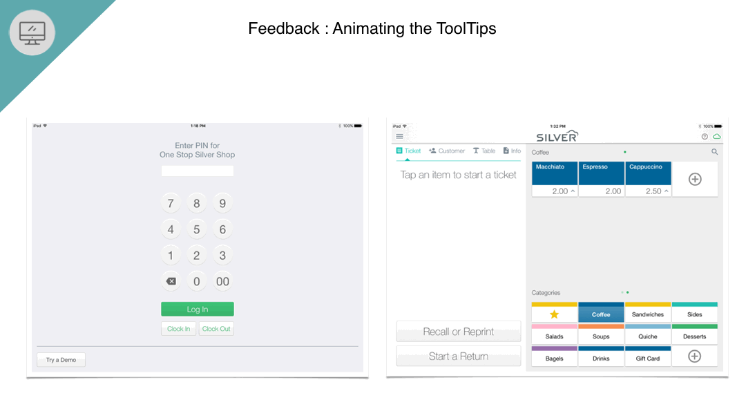
First ideation - Tool tips

Based on initial usability testing feedback, we observed that the tooltips were not grabbing the user’s attention well enough so, we added animations such as the slide in element.
Guided Feature Walkthrough Iteration

Usability Testing Insights
Pros
-
“I really like how the popup dialog is conversational and guides me.”
-
"I really like the animations. They helped me be more engaged"
Cons
-
“Some of the grey dialog boxes don't stand out enough.”
-
"The wording on the Test Transaction dialog box feels contradictory to me and it gives me an option to not do it now, but not how to do it later."
Tooltips Design Iteration
Users felt the first iteration felt too much like a button, but felt iteration 2 colors contrasted nicely and were more attention grabbing.

Final Guided Feature Walkthrough Design
Here you can see the final designs of the guided feature walkthrough. We didn’t change the functionality of the card as users responded positively but we did clean up the design to reflect a higher fidelity and hint at the proposed UI refresh.

UI Refresh
Here is the main ticket screen where a user would build an order for a customer. On the right, our proposed design refresh cleans up the UI and brings consistency to the design system.

UI refresh by teammate Hayes White
Here is another example of an updated design seen here applied to the payment method screen. While not yet fully developed, and certainly not exhaustive, these changes are designed to be subtle, focusing on refreshed consistency for a more pleasant user experience.

UI refresh by teammate Hayes White
Our proposed solution helps users figure out their problems and get solutions all within the app by providing them helpful guidance and tutorials in an easily understood and intuitive way. This process sets the user up for success and confidence to get the app up and running quickly, without needing to call support or watch videos.

Final walkthrough showcasing both the new Onboarding components as well as our proposed updates to enhance the user experience with a clean and consistent design system.